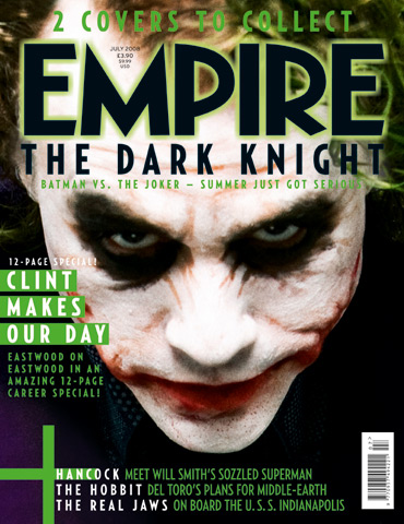
The mast head is the name of the magazine and
is in froun of the main image, this makes the magazine more noticable by the
target audience. The fount which the mast head has been wrote in sans serif,
and is very bold and has a highlight of green around the edge making it very
easy to stand out. This shows that it is not going to be a girlly film as it
links in with the main image with the sharpe edges and how cut off the
lettering is.the colours that which the text has been written in are
black,green and white these have been chosen well as they go together very well
making the magazine look high and perforessional as the colours look good
togther.
You will find
that the magazine Empire will often use the main charcter from the film as this
will then add to the advertisisment showing who the main charcters are going to
be within it. ‘The jokers’ head is tilted facing down this gives off the effect
also that he is trying in scare yo of be in power giving off the impress he
thinks that he is better than everyone else. When you first catch the magazine
it looks like ‘the joker’ is just a normal scary clown but by the lighting
wehich has been used highlights his face showing us what he really does look
like under the face paint and we can see hes true identiy.
The colours
of this magazine are linked with the main image using the colours of his hair
and also the purple jacket which he is wearing.( Purple, Black and Green )
these are the main colours which have been used on the magazine expect the
colours of the jokers light up face this attracts the attention. The main cover
line on this magazine is aqbout the image but does not mentin this charcter
within, the cover line is not as obvious as you would think it would be on this
magazine because it almost looks like it is part of the mast head as of the
colours and fount which has been used.
Plugs have
been used throughout of the frount cover these are here to give you some extra
informtion about what you are going to see in the magazine. Here they have put
the words in white which would catch the target audience eyes they have done
this with the names of films. The target audience see that these words are different
from the rest of the sentence making them want to read more and look inside or
buy the magazine to read the informtion as they may not be intrested in the
main image film but others.
No comments:
Post a Comment