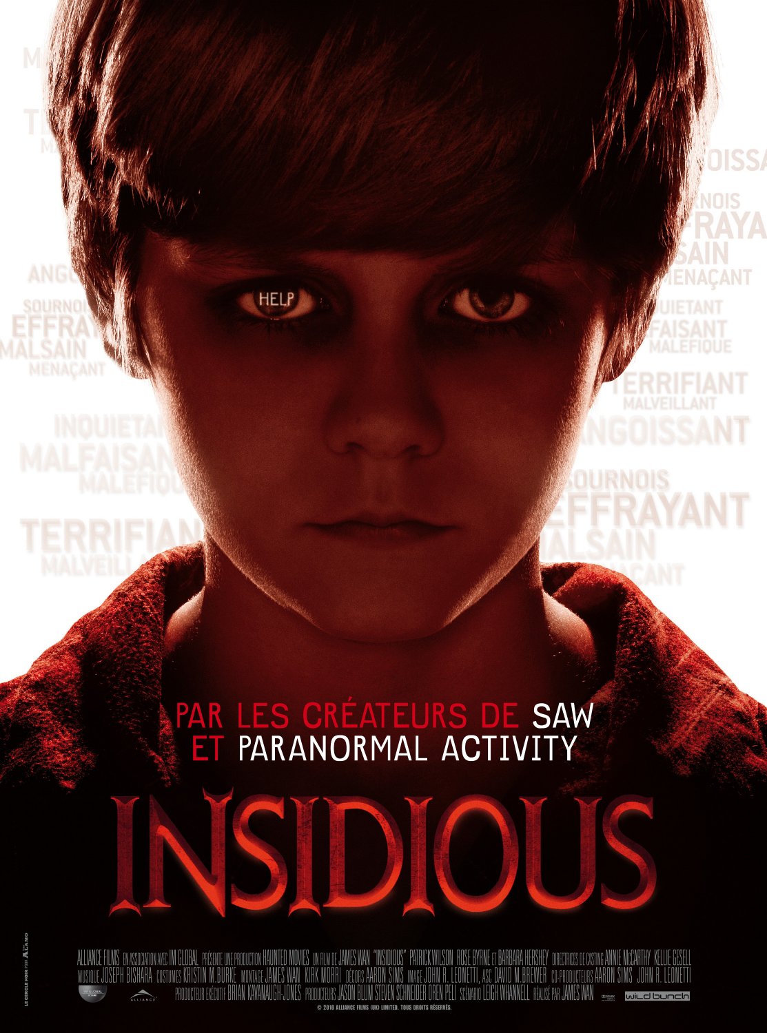
When looking
at horror film posters, I can see that just like horror film trailers, they all
use the same codes and conventions to make their poster stand out and fit in
with their genre. All posters have a main image which will represent the main
story line, for example in this Insidious poster the main image is off the main
character.
·
The
first feature I notice on this advert is the main image. We have a picture of
the boy (who is the main character) and behind him is his house. This tells us
straight away that this film is about this boy and will have something to do
with the scary looking house behind him. The house and the boy both have a dark
colour to them which makes the poster fit in with the genre horror.
·
There
are many different types of horror films like Religious Horror, comedy
horror, Serial Killer, Ghost Stories and
Monster Movies. By this poster were not
sure what the type of horror film it is but we do know it’s not comedy horror.
·
The
text on this poster is all in white large font apart from the two letters in
the title (S and I) which are the colour red. In horror films red always
represents danger or blood which fits in with the films genre. The title on
this poster has been positioned vernicle and other test has been placed in a
smaller font around it. The other text
around the title has important information like the release date and the film
makers. And lastly underneath the title there is a tag line which says “it’s
not the house that’s haunted” this makes the audience question what is scary
about this film.
·
The
colours used in this poster are all darker colours apart from the bit of red in
the title and the red on the little boy’s shirt. The colour red fits in with
the horror genre because people relate the colour red as danger or blood.