Analysts of a Horror Film Poster - Paranormal Activity 4
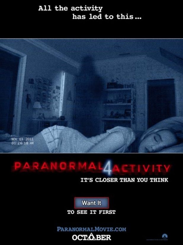
- When you take a first look at this film poster, I first noticed the dark figure on the back wall, this is shown to be a shadow in the shape of a human figure. The light has been created by what shows to be in front of the image you cannot actually tell where it is coming from but as there is a light reflecting and lighting the room up it shows you that the scene is set at night.
- The second lighting on the poster is coming from the crack in the door which looks like when someone comes into the room or has been and hasn't shut the door properly. In this case it makes the audience think that this has happened because the girl is sleeping so they don't want to wake her or even the fact that they might not want to know they are there.
- the colour of the image is a blue glare, not a typical camera lenses colour meaning that it is a different type of technology which is catching the image maybe a mobile phone, tablets, TV or a laptop on some sort.
- The girl is the image looks to be a very stereo typical teenager looking pretty, blonde hair, not wearing my many clothes with no covers on. The image is making the girl look like a stereo typical character which we expect to see in a horror movie a pretty, helpless girl who needs saving.
- If you look to the right and left of the image it shows to dark doorways, I think that this gives off the effect that the girl looks like she is being cornered by the two dark doors and the shadow in the middle. Making her seem small and weak and that she has no escape.
- The film name is in bright red at the bottom of the image which is very eye catching drawing us in to remembering the name of the film. Also as the colour is red is also could show the danger that the girl is in because its so striking and red is the colour of danger and blood.
No comments:
Post a Comment