
Friday, 25 October 2013
Friday, 18 October 2013


Script
EXT. LIVING ROOM – NIGHT
TITLE: Just when you think your safe
MEDIUM SHOT of girls sat on sofa, eating popcorn dark, light reflecting off the TV on their faces.
HAND HELD PAIGE running up the stairs, turns left,
freezes ABBIE is stood at the end of the corridor.
OVER THE SHOULDER PAIGE slams door in ABBIES face.
Camera effect two shots, flicking from a CLOSE UP of
ABBIE normal to how she’s looks now she has a demon in her.
EXT. BATHROOM – NIGHT
PAIGE brushing her teeth in the mirror, ABBIE
appears behind her as she looks up.
TITLE: COMING SOON! 31st October 2013
LONG SHOT of PAIGE laid dead on the floor covered in
blood with ABBIE walking over her carrying a knife walking down the corridor
towards the door in blood footprints.
Black
screen.
Sound effects over it all.
CLOSE UP of DVD sitting in the DVD player closing.
Sound effects scary, confusing music.
TITLE: Just when you think your safe
MEDIUM SHOT of girls sat on sofa, eating popcorn dark, light reflecting off the TV on their faces.
TITLE: you can't always trust them closest to you.
DUTCH TILT of living room, big French doors, showing
garden light come on.
OVER
THE SHOULDER showing no one is there, girls turn to look at the TV, gone off
showing grey screen.
PAIGE
AND ABBIE
Aurghh!! (Reaction)
MEDIUM SHOT of TV fuzzy.
TITLE: Now its your turn to be the star.
Camera speeds up showing the clips faster.
EXTREME CLOSE UP of windows being locked.
CLOSE UP of doors being locked.
EXT. GARDEN – NIGHT
Sound effects over it all.
LONG SHOT ABBIE stood in the garden, at the end of
the garden, looking different.
LOW ANGLE of the whole house showing ABBIE stood in
the top left window looking down in the garden; PAIGE sat on sofa in the bottom
right hand corner through the French doors.
EXT. STAIR WAY/CORRIDOR – NIGHT
Sound effects over it all.
TITLE: HOME
EXT. KITCHEN – NIGHT
Actors and models
For the movie trailer:
For the film
trailer we will need me (Abbie Holt) and Paige Singer as our on screen actors because
we are the two main characters in our movie.
Both actors costume will be P’js because its set Paige’s characters
house at a sleepover. For my film poster:
No models needed for my film poster because it will be an image of Paige’s house from the outside. The picture will be taken in the evening so the picture is dark to fit in with the genre horror.
Production schedule
Scene 1:
Actors used: Abbie Holt & Paige Singer
Director: Abbie Holt &
Paige Singer
Location: Paige’s living room
Time: Evening
Health and safety: Be careful around
sharp objects and glass in the living room.
Crew: Abbie Holt &
Paige Singer
Scene 2:
Actors used: Abbie
Holt & Paige Singer
Director: Abbie
Holt & Paige Singer
Location: Back
Garden
Time: Evening
Health and safety: uneven
floor, or rain because of the electrical equipment.
Crew: Abbie Holt & Paige Singer
Scene 3:
Actors used:
Abbie Holt & Paige Singer
Director: Abbie
Holt & Paige Singer
Location: stairs
and landing
Time: Evening
Health and safety: Careful
running up stars
Crew:
Abbie Holt & Paige Singer
Scene 4:
Actors used: Abbie Holt & Paige Singer
Director: Abbie
Holt & Paige Singer
Location: Bathroom
Time: Evening
Health and safety: careful
to not slip on wet tile floor
Crew: Abbie
Holt & Paige Singer
Scene 5:
Actors used: Abbie
Holt & Paige Singer
Director: Abbie
Holt & Paige Singer
Location: Kitchen
Time: Evening
Health and safety:
careful around kitchen appliances/ don’t slip on wet tile floor.
Crew: Abbie
Holt & Paige Singer

Props, Costume, Equipment
Props-
- Camera, Video and image,
- Tripod,
Knife- To use in the end scene to show what has caused the
death, the scene on the crime.
Toothbrush – to set the scene in the bathroom and see why
Paige is in there.
Popcorn/Drink – to show that the girls are having a girly
sleepover, with the typical popcorn and movie.
Costume-
The scene is set at a stereo typical girl sleep over, both
girls where the typical long pjs, in very girly colours such as pinks and
purples. This shows the audience that at the start of the film it is a typical
girl sleepover because of the props used and how the scene is set and also what
costumes which they are wearing.
Equipment –
-
Apple Mac, Garage Band, Final cut pro, Photoshop - Camera, Video and image,
- Tripod,
Friday, 11 October 2013
Film Magazine Cover Analysis

In my post
production research, I have to do an analysis of a film magazine cover. This is
so I can use all the codes and conventions when I make my own magazine cover.
The first
thing I notice on this magazine is the large main image of “the joker”. This
straight away tells the audience that it is a film magazine, and inside will
have a big section about the new film “The Dark Knight”. They have made the image take up most of the
page and it is also covering the “Empire” title. This gives the image a sense
of overpowering. This is okay because they always use the same colour and font
for the title so it will still be recognisable to the shoppers when the
magazine is on the shop shelf.
The second thing I notice when looking at this magazine cover is the title which is always the same for “Empire” magazines. They always use a large red font which is placed at the top of the page. This makes it very recognisable for the “Empire” fans and also makes the magazine stand out on the shop shelves.
On the left
hand side of the page the text which says “meet the joker” has been edited in a
sharp pointy font to match the evilness of the cover. It has also been coloured
in purple and green to match the jokers colours, they have done this so that
the colours all blend together to make the magazine cover look dark.
Each magazine
has the date and price on the cover. Empire has chosen to put it in the middle
of the letter “M” in the title.
There are
also some plugs on the right hand side off the page. Plugs are extra
information which is put on the cover to tell the audience what else is featured
inside this magazine.
Magazine Frount Cover Anylsis
For my
reasearch I also had to anaylsis a frount cover of a music magazine, I found
that Empire magazine do not advertise horror movie, the genre which I am
foucusing in. So I decided to anylis the frount cover with the joker on because
it will be dark and have the same scare effect as a horror movie would. The
target audience for this magazine are film fans, they chose the main image from
the a big up coming film in the industy in this case it is ‘The dark knight’ so
by advertising this magazine they have chose to make the main image the villian
on the film, looking very serious and also staring towards you making you feel
like they are looking at you.
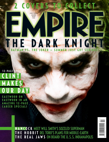
The mast head is the name of the magazine and
is in froun of the main image, this makes the magazine more noticable by the
target audience. The fount which the mast head has been wrote in sans serif,
and is very bold and has a highlight of green around the edge making it very
easy to stand out. This shows that it is not going to be a girlly film as it
links in with the main image with the sharpe edges and how cut off the
lettering is.the colours that which the text has been written in are
black,green and white these have been chosen well as they go together very well
making the magazine look high and perforessional as the colours look good
togther.
You will find
that the magazine Empire will often use the main charcter from the film as this
will then add to the advertisisment showing who the main charcters are going to
be within it. ‘The jokers’ head is tilted facing down this gives off the effect
also that he is trying in scare yo of be in power giving off the impress he
thinks that he is better than everyone else. When you first catch the magazine
it looks like ‘the joker’ is just a normal scary clown but by the lighting
wehich has been used highlights his face showing us what he really does look
like under the face paint and we can see hes true identiy.
The colours
of this magazine are linked with the main image using the colours of his hair
and also the purple jacket which he is wearing.( Purple, Black and Green )
these are the main colours which have been used on the magazine expect the
colours of the jokers light up face this attracts the attention. The main cover
line on this magazine is aqbout the image but does not mentin this charcter
within, the cover line is not as obvious as you would think it would be on this
magazine because it almost looks like it is part of the mast head as of the
colours and fount which has been used.
Plugs have
been used throughout of the frount cover these are here to give you some extra
informtion about what you are going to see in the magazine. Here they have put
the words in white which would catch the target audience eyes they have done
this with the names of films. The target audience see that these words are different
from the rest of the sentence making them want to read more and look inside or
buy the magazine to read the informtion as they may not be intrested in the
main image film but others.
Thursday, 10 October 2013
Synopsis
Start: To start the film we are introduced to the main characters who are these two best friends who are having a sleepover. We are told more about the storyline as we find out there having a weekend long sleepover because one girl’s parents are away for the weekend and have left her home alone. Like every start of a horror film we start the film in a “happy” atmosphere like everything is “normal”, which makes the audience suspicious. We see the girls start to watch a scary movie while sat on the sofa; they have popcorn and everything seems to be just like a normal sleepover. While watching the scary film, the unusual activity starts to happen. The first strange activity to happen isn’t very scary, but the girls notice that the garden light has turned on. This indicates someone’s in your garden, but when they go to look no one is there. The girls just suspect it’s a cat and go back to watching there film. Then while watching more of the film the TV just turns off while the remotes is sat on the TV stand, this starts to make the girls suspicious. The girls start to here strange sounds coming from outside and start to get scared.
Middle: Now the girls are extremely scared and they rush around the house making sure every window and door is locked. A lot of strange activity starts to happen in the middle of the film; doors slam, objects move, strange sounds are made and the girls get extremely scared. We also find out in the middle of the film that it’s one of the girls who are actually doing all this strange activity because she has been taken over by something. The girl starts to go crazy and takes over, her aim to kill her friend.
End: At the end of the film is when things get really bad, and for most horror films people die. We have loads of scares while we see ‘Paige’ trying to escape from this house. We wanted our film to match the stereo typical scary film ending where someone dies. So we decided that we wanted ‘Abbie’ (who is the friend who has been taken over by some demon) to be the one to kill her friend. At the end of the film the words “Abbie’s whereabouts are still unknown” appear on the screen.
Proposal
Our media task for A2 media is to create a horror trailer, a poster to advertise the film and also a front cover of a film magazine to advertise the horror movie in a different way. We decided that our target audience is for older teenagers from 16 year olds all the way to 30 year olds. The reason the teenager age is so high is because we decide that our movie would need an age restriction on it as the images are very graphic and violent and would not be suitable for younger people.
In my research I have analysed two different film trailers one from a film which is the same type of horror film that we are doing such as a paranormal film called ‘Paranormal Activity’ and one completely different from the series of horror movies ‘Scream’ which I compared the two film horror trailers in my analysis. Also in my research I had to analyse two different posters in my research I found that they both advertised there film in very similar ways to say the style of the horror movie was very different. I will use cameras, computers and editing program called photo shop on the Macs which will be hired out in a suite with all the technology which I will need to produce it. We will produce my magazine I will use photo shop on the pcs. We will have a budget of £600,000 to complete all of these tasks.
In my research I have analysed two different film trailers one from a film which is the same type of horror film that we are doing such as a paranormal film called ‘Paranormal Activity’ and one completely different from the series of horror movies ‘Scream’ which I compared the two film horror trailers in my analysis. Also in my research I had to analyse two different posters in my research I found that they both advertised there film in very similar ways to say the style of the horror movie was very different. I will use cameras, computers and editing program called photo shop on the Macs which will be hired out in a suite with all the technology which I will need to produce it. We will produce my magazine I will use photo shop on the pcs. We will have a budget of £600,000 to complete all of these tasks.
Friday, 4 October 2013
Analyst of a Horror Film Poster - Scream
- The film poster for scream is very different to the paranormal activity poster within the image but not very different between the layout or the colours of the poster,
- The scream poster is in a grey and black colours giving us a dark and scary feel to the poster, but also does not give off a lot of information about what is involved within the film because the image is such an extreme close up,
- As the image is so close up its very hard to get what the image is about but what we can see the image is of a young girl again like the paranormal activity poster. The eyes are shown is the crystal blue which makes the audience think that this is a blonde girl as its a stereo typical blonde young girls, blue eyes showing us that she make be vulnerable or need help and saving.
- We can also see by her facial expressions that the model looks shocked or is looking at something which she is scared of because of the way she is covering up her mouth and how wide her eyes are.
- Compared to the paranormal activity poster where the girl is also vulnerable but she does not know what is going off showing two very different ways how the girls made need saving. Also showing the audience how weak they actually are that they cant fit for them self showing that really they are useless and probably will be killed in the film also playing one of the main characters.
- The title stand out in a very different way to the paranormal activity poster title did because this is in lard bold writing in a white giving a plain and empty feel towards it. But the letters within the word are very spaced out I think that this gives off the effect of they are trying to make the word 'scream' look bigger and longer as they dragging it out also showing us its not just a small scream. Therefore within the film its going to be a long death that the victim could feel.

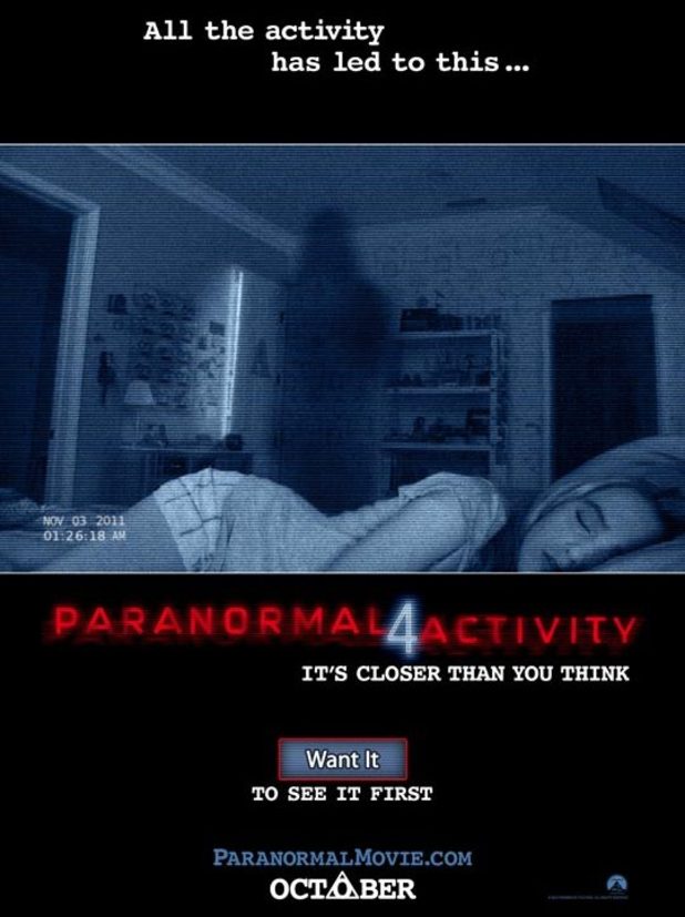
Analysts of a Horror Film Poster - Paranormal Activity 4
- When you take a first look at this film poster, I first noticed the dark figure on the back wall, this is shown to be a shadow in the shape of a human figure. The light has been created by what shows to be in front of the image you cannot actually tell where it is coming from but as there is a light reflecting and lighting the room up it shows you that the scene is set at night.
- The second lighting on the poster is coming from the crack in the door which looks like when someone comes into the room or has been and hasn't shut the door properly. In this case it makes the audience think that this has happened because the girl is sleeping so they don't want to wake her or even the fact that they might not want to know they are there.
- the colour of the image is a blue glare, not a typical camera lenses colour meaning that it is a different type of technology which is catching the image maybe a mobile phone, tablets, TV or a laptop on some sort.
- The girl is the image looks to be a very stereo typical teenager looking pretty, blonde hair, not wearing my many clothes with no covers on. The image is making the girl look like a stereo typical character which we expect to see in a horror movie a pretty, helpless girl who needs saving.
- If you look to the right and left of the image it shows to dark doorways, I think that this gives off the effect that the girl looks like she is being cornered by the two dark doors and the shadow in the middle. Making her seem small and weak and that she has no escape.
- The film name is in bright red at the bottom of the image which is very eye catching drawing us in to remembering the name of the film. Also as the colour is red is also could show the danger that the girl is in because its so striking and red is the colour of danger and blood.
Our Survey Results
The results from our survey show that the most popular type of horror movie is paranormal, this is perfect results because our horror movie will mainly be based on paranormal. By having good results it shows that our trailer will relate to our target audience as more than half of the people which answered our survey was the age our target audience is based as. From looking through the results that we have resulted from our survey 95.24% that a trailer persuades them more to watch the film than a poster. This shows that I need to create a poster that makes my target audience want to watch our movie persuading them more than most posters usually would.


Subscribe to:
Posts (Atom)